
How High Should You Hang Wall Art? A Designer’s Guide to Perfect Placement

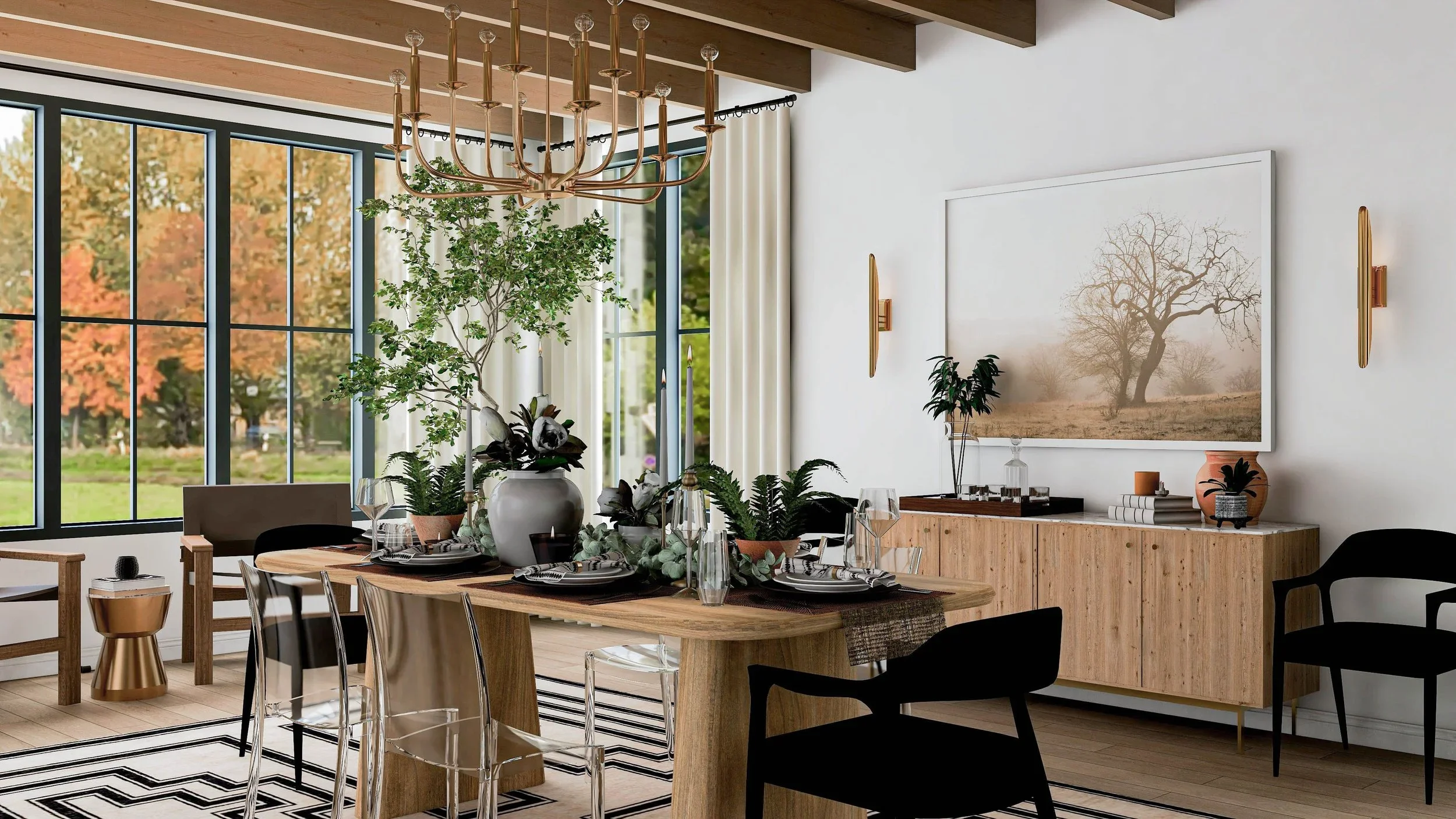
Photorealistic 3D rendering of a rustic glam dining room designed by virtual interior designer Joshua Jones of JJones Design Co., showcasing balanced wall art placement above the sideboard.
Why Wall Art Height Matters
When it comes to styling a room, few details affect the overall balance as much as the height of wall art. Hang it too high or too low, and even the most beautiful artwork can look oddly out of place.
I learned this lesson firsthand early in my virtual interior design career. At the time, I often advised clients to hang their art “within eye level.” It seemed like simple, clear advice—until I started seeing the after photos from clients’ finished spaces.
A couple of my clients were very tall, and naturally, their idea of “eye level” was much higher than average. Their art ended up noticeably higher on the wall than intended. In contrast, a few other clients who were much shorter had the opposite result, with their artwork hung too low.
Since I never meet my virtual clients in person, I have no way of knowing their height, and I realized that “eye level” is a subjective concept. What feels right for one person might look completely off-balance for another. That’s when I stopped using “eye level” as a guideline and began relying on a more universal, designer-approved standard that works for every space.
In this guide, I’ll share that approach—plus professional tips for hanging wall art at the perfect height every time.

A simple visual guide demonstrating the 57-inch rule for hanging wall art at average eye level — created by virtual interior designer Joshua Jones of JJones Design Co.
The Golden Rule: 57 Inches to the Center
After years of seeing how subjective “eye level” can be, I began using a measurement that designers and galleries swear by—the 57-inch rule.
This standard is based on the average human eye level and is used by museums and professional galleries to achieve a perfectly balanced visual flow. The idea is simple:
The center of your artwork should be approximately 57 inches from the floor.
This measurement keeps artwork aligned with natural sightlines and creates harmony with the architecture of a room. It also works beautifully whether you’re hanging one large piece or creating a gallery wall.
Here’s how to apply it:
Measure 57 inches up from the floor and mark that spot on the wall.
Measure the total height of your artwork and divide that number by two to find its center.
Subtract the distance between the top of the frame and the hanging point (the hook or wire) if applicable.
Align that hanging point so that when you hang the piece, the center sits exactly at your 57-inch mark.
That’s it—you’ve just achieved museum-level balance without overthinking it.
Of course, rules can be flexible. For rooms with extra-tall ceilings or open layouts, you can raise the center to around 60 inches for better proportion, but 57 inches is the go-to starting point for nearly every home.
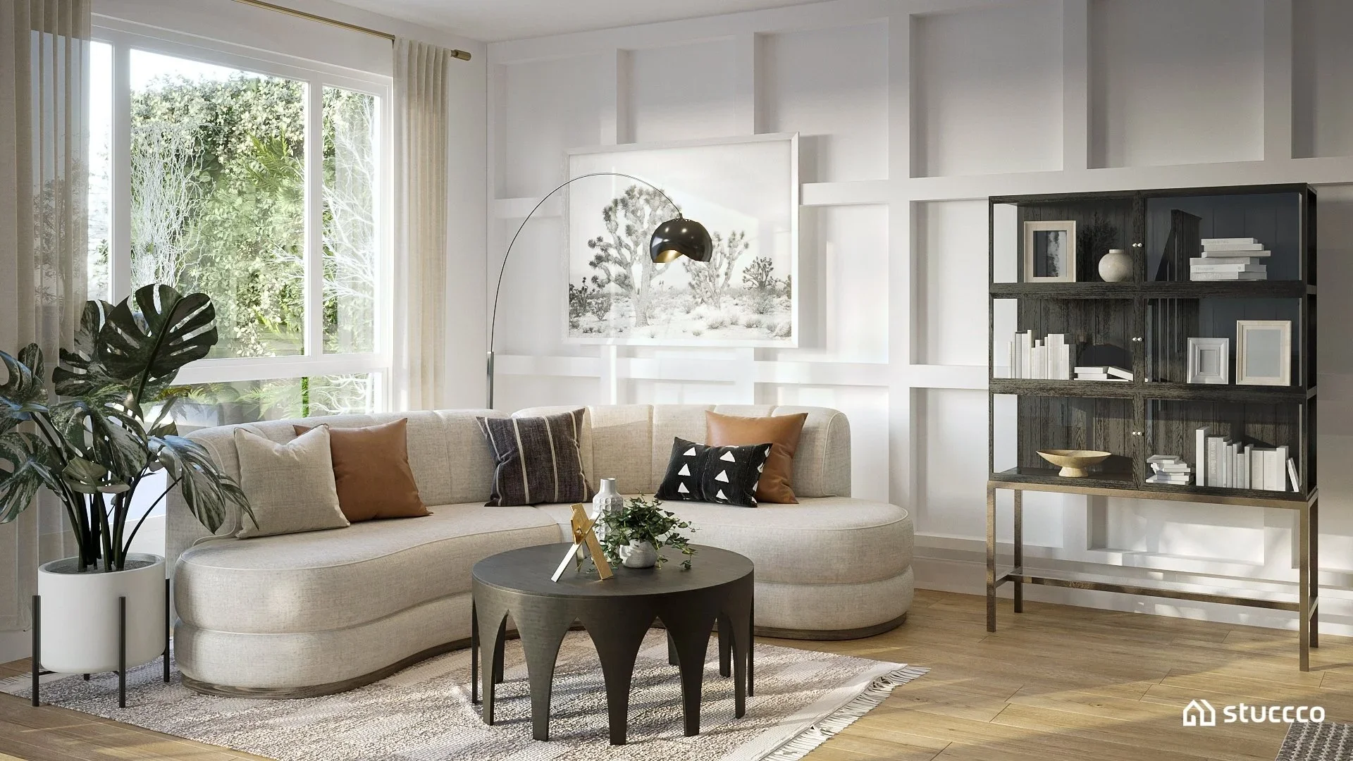
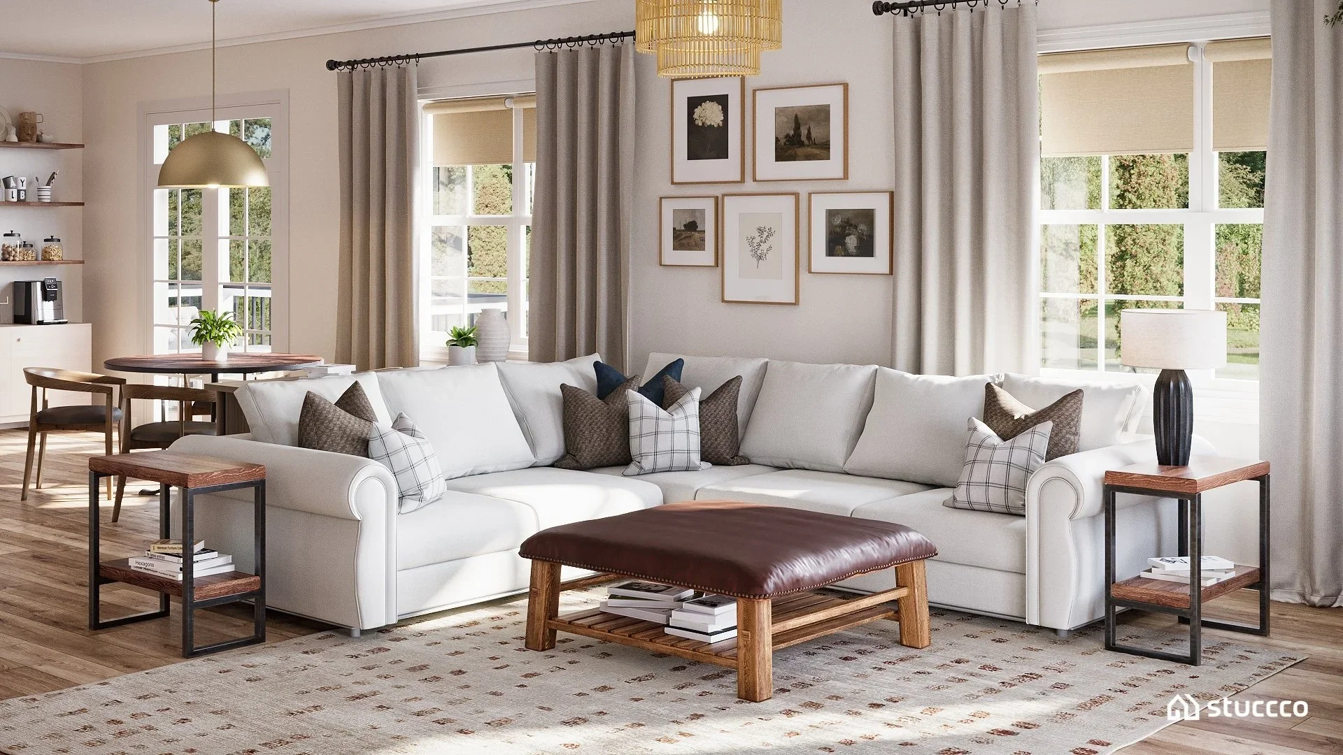
Photorealistic 3D rendering of a California casual living room designed by virtual interior designer Joshua Jones of JJones Design Co., created in collaboration with Stuccco. The artwork above the sofa illustrates proper wall art placement height.
Hanging Art Above Furniture: Adjust for Proportion
When hanging wall art above furniture, proportion becomes just as important as height. Even if you follow the 57-inch rule perfectly, artwork that’s too high above a sofa or console can look disconnected from the rest of the room.
A reliable designer guideline is to keep 6 to 8 inches of space between the top of the furniture and the bottom of the artwork. This subtle spacing helps the art feel visually connected to the furniture below it, creating a cohesive composition instead of two floating elements on a wall.
You’ll also want to pay attention to width. As a rule of thumb, the artwork (or grouping of pieces) should span roughly two-thirds the width of the furniture piece. This proportion keeps everything balanced and intentional.
For example:
Over a 72-inch sofa, aim for a single 48-inch-wide piece or a grouping of smaller pieces that collectively measure around that width.
Over a bed or console table, the same two-thirds rule applies—wide enough to anchor the space but not so large that it feels heavy.
It’s these small details that make a room look professionally designed, even in a virtual setup.
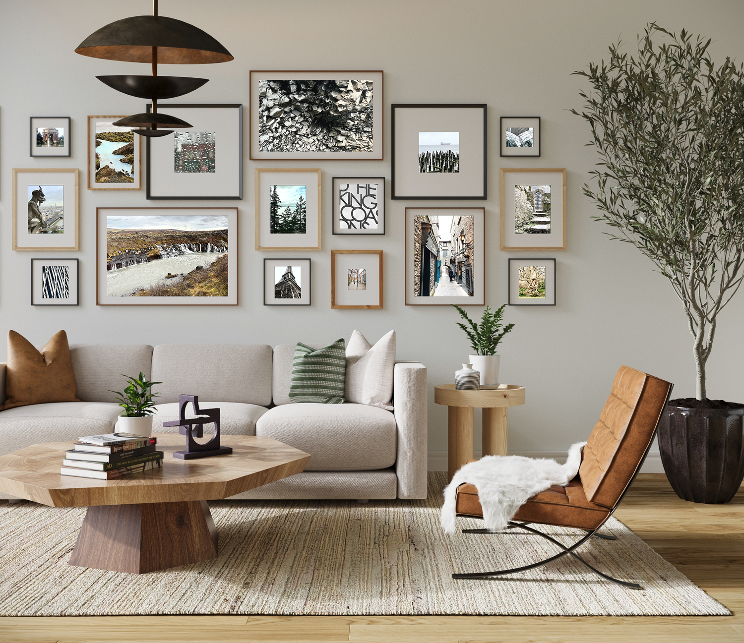
Photorealistic 3D rendering of a rustic modern living room designed by virtual interior designer Joshua Jones of JJones Design Co., featuring a balanced gallery wall arrangement that demonstrates cohesive spacing and alignment.
Gallery Walls and Multi-Piece Arrangements
A well-balanced gallery wall can completely transform a blank wall, but it’s also where many people go wrong. The key is to treat the entire grouping as one large piece of art rather than thinking of each frame individually.
Start by finding the visual center of your layout and aligning that point 57 inches from the floor—just as you would for a single artwork. This ensures the entire arrangement sits comfortably at eye level and doesn’t feel like it’s floating too high or sliding too low.
When spacing the frames, aim for 2 to 3 inches between each piece. Consistent spacing keeps the gallery wall looking cohesive, even if the art varies in size or frame style.
Here’s how to plan your arrangement with ease:
Lay out your frames on the floor first. Arrange and adjust until it feels balanced.
Use painter’s tape or paper templates on the wall to map out your layout before committing to nails.
Keep alignment flexible but intentional. You can center frames along the middle line, the top, or the bottom—just stay consistent across the arrangement.
Whether you prefer a perfect grid or a more organic mix, what matters most is balance and connection to the furniture or architecture nearby. The goal is to make the wall art feel like part of the room, not an afterthought.
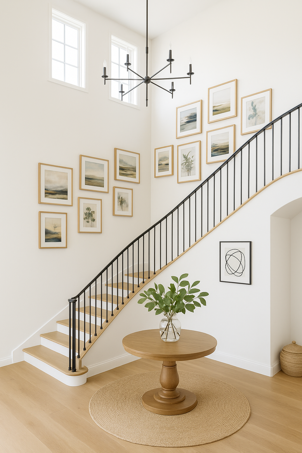
AI-generated image inspired by the designer’s guide for hanging artwork along a curved staircase wall.
Special Situations: Staircases and Tall Walls
Not every wall fits neatly into the 57-inch rule. Staircases, two-story rooms, and double-height walls often require a few thoughtful adjustments to keep the space feeling balanced and intentional.
For staircases:
Follow the natural rise of the stairs. Imagine an invisible line that runs parallel to the stair angle—your artwork should follow that line. The centers of the frames should stay aligned along this diagonal path rather than sitting at a fixed height. This creates a visual rhythm that feels connected to the movement of the stairs.
For tall or double-height walls:
If your room has very high ceilings, hanging art at 57 inches can make it feel too low within the vertical space. In these cases, aim for the center of the artwork to sit around 60–62 inches from the floor. This slight upward adjustment ensures the art feels proportionate to the scale of the wall without losing its human-level connection.
That said, design rules are meant to serve you, not the other way around. Sometimes, intentionally breaking the rule—by placing artwork slightly higher or lower for dramatic effect—can bring personality to a space when done with purpose and balance.
Photorealistic 3D rendering of a transitional family room designed by virtual interior designer Joshua Jones of JJones Design Co., created in collaboration with Stuccco. The symmetrical wall art arrangement demonstrates cohesive alignment and balanced spacing above the sectional sofa.
Framed Photos, Canvases, and Art Prints — Does It Change?
One of the most common questions I get from clients is whether the hanging height changes depending on what type of artwork you’re displaying — framed photos, canvas prints, or art pieces on paper. The answer is simple: the same placement principles apply to all.
Whether your piece is framed, stretched, or mounted directly on the wall, the visual goal remains the same — to keep the center around eye level (about 57 inches from the floor) or adjusted slightly for furniture placement.
However, the weight and depth of the piece can influence how it looks once hung. For example, a thicker canvas may appear slightly higher than a thinly framed photo, even when centered at the same height. In these cases, trust your eye and make tiny adjustments until it feels balanced from a few steps back.
If you’re displaying multiple pieces together, consistency is key. Use similar frame thicknesses or colors to maintain a cohesive, gallery-like feel.
And if you’re looking for framed photography that’s designed to elevate your space, explore my collection of modern organic photo art, available in a range of sizes and finishes to suit every style of home.
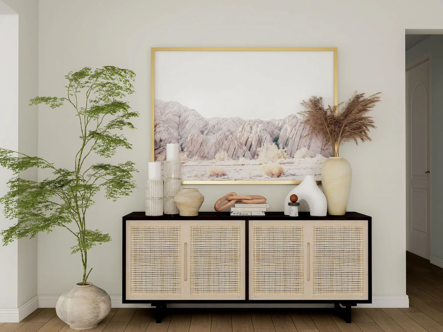
Photorealistic 3D rendering of a California casual entryway designed by virtual interior designer Joshua Jones of JJones Design Co., showcasing intentional wall art placement above the console for a polished and cohesive look.
Design with Intention: The Secret to a Polished Space
Hanging wall art isn’t just about filling empty walls — it’s about creating balance and harmony in a space. Even the most stunning artwork can feel out of place if it’s positioned a few inches too high or low. When hung with intention, though, art becomes part of the room’s architecture, guiding the eye and enhancing the overall flow.
The secret to achieving that polished, designer look lies in understanding proportion and consistency. Start with the 57-inch rule, adjust for your furniture and ceiling height, and always step back to see how the placement feels from different angles.
When art is thoughtfully positioned, it doesn’t just decorate — it completes the design story of your home. That’s the power of placement, and it’s what transforms a space from styled to truly curated.

