Neon Signs: A Designer's Guide to Choosing the Right Size, Color & Placement
Anyone who lived through the 1980s probably remembers seeing neon everywhere. Shopping malls, restaurants, bars, movie theaters, and storefronts often featured colorful neon signs or architectural neon lighting as part of their design. Over the decades, much of that neon disappeared, aside from the occasional "Open" sign or beverage advertisement still found in some convenience stores, restaurants, and bars.
In recent years, however, neon has made a comeback. Today's neon signs are more stylish, energy-efficient, and personal than the neon signs many of us remember from the 1980s. Instead of promoting a business or product, they're now being used to display favorite quotes, company logos, family sayings, and even handwritten messages.
As an interior designer, I view neon signs as more than just decorative lighting. When chosen carefully, they can become an intentional part of a room's design. In this guide, I'll share my tips for choosing the right size, color, and placement for a neon sign so it complements your space rather than competing with it.
Personalized neon sign above a bed in a modern bedroom. Image courtesy of Custom Neon.
Why Neon Signs Are Making a Comeback
For many years, neon signs were often associated with bars, diners, casinos, and storefronts. While they never completely disappeared, they gradually became less common as design trends shifted and businesses moved toward other types of signage.
Today's revival feels very different.
Instead of being used primarily for advertising, neon is now being incorporated into homes, offices, restaurants, retail stores, fitness studios, and hospitality spaces. Homeowners are using it to display favorite quotes, family sayings, game room slogans, and personalized messages, while businesses are incorporating neon into their branding and customer experience.
Part of the reason for this resurgence is technology. Unlike the fragile glass neon of decades past, most modern neon signs use LED lighting that is more energy-efficient, durable, lightweight, and easier to install. This has made neon far more accessible to homeowners and small business owners than it was in the past.
Another reason is that people are looking for ways to personalize their spaces. In residential interiors, neon signs are often being used as an alternative to traditional wall art, adding a layer of personality that feels unique to the homeowner. I've seen them used successfully in home offices, game rooms, home bars, media rooms, and even children's bedrooms.
Social media has also contributed to its popularity. Restaurants, cafés, salons, and retail stores are increasingly looking for memorable design features that encourage customers to take photos and share them online. A well-placed neon sign can help create a recognizable backdrop that people remember long after they leave.
Perhaps the biggest difference between today's neon signs and those of the past is personalization. In the 1980s, most neon was designed to advertise a business, product, or service. Today, it is just as likely to celebrate a family, hobby, milestone, or meaningful memory as it is to promote a brand.
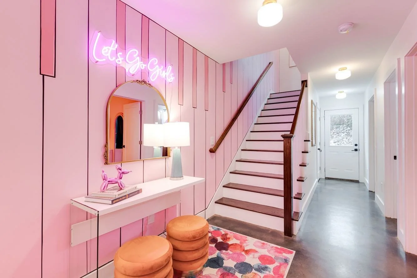
Neon sign used as a statement piece in an entryway. Image courtesy of Custom Neon.
How to Choose the Right Color for a Neon Sign
When most people think about neon signs, color is usually the first thing that comes to mind. While bright pinks, blues, and reds often get the most attention, choosing the right color involves more than simply picking your favorite.
The best color is usually one that complements the space rather than competing with it.
Start With the Room's Existing Color Palette
Before selecting a color, take a look at the finishes already in the room. Wall colors, furniture, artwork, rugs, flooring, and decorative accessories all influence how a neon sign will look once it's installed.
For example, a bright red sign may feel right at home in a game room or sports-themed space but could feel out of place in a calm, neutral bedroom. Likewise, a warm white sign may blend beautifully into a Modern Organic or Scandinavian-inspired interior where softer colors dominate the palette.
The goal isn't necessarily to match the room, but to make sure the sign feels connected to the overall design.
White and Warm White Are Often the Safest Choice
When people hear the word "neon," they often picture bright, colorful signs. However, white and warm white have become some of the most popular options for residential spaces.
One reason is versatility. These colors work well with a wide range of design styles, including Contemporary, Transitional, Modern Organic, Scandinavian, Coastal, and even some Traditional interiors.
They also tend to age well. While a bright color may feel trendy today, white and warm white often remain timeless and easier to incorporate as a room evolves over time.
Use Bold Colors Intentionally
That doesn't mean bold colors should be avoided.
In the right setting, a vibrant pink, blue, green, or red sign can become one of the most memorable features in a room. I often see bolder colors work particularly well in game rooms, home bars, media rooms, retail stores, restaurants, and other spaces where a more playful atmosphere is desired.
The key is making sure the color supports the room rather than dominating it.
Don't Forget About the Wall Behind It
The wall color can be just as important as the sign itself.
A white sign on a white wall may not stand out very well, while a deep blue sign can disappear against a dark navy background. Creating enough contrast between the sign and the surface behind it helps improve both visibility and visual impact.
I've found that even a beautiful sign can lose much of its effect if it blends too closely with the wall.
My Design Tip
If you're struggling to choose between a bold color and a neutral one, think about the room's purpose.
For spaces designed to feel calm and relaxing, I generally lean toward white or warm white. For spaces intended to feel energetic, playful, or memorable, a bolder color can often be the better choice.
Either approach can work. The most important thing is making sure the color feels appropriate for the space and the experience you're trying to create.
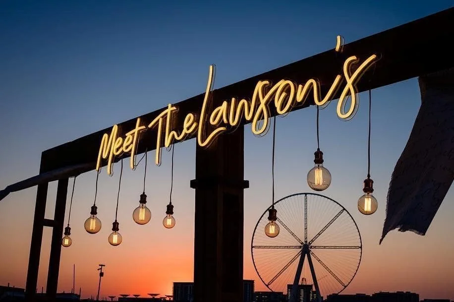
Custom family neon sign displayed at a special event. Image courtesy of Custom Neon.
How to Choose the Right Size for a Neon Sign
Choosing the right size can be surprisingly challenging. A sign that is too small may disappear against the wall, while one that is too large can overwhelm the room and compete with everything around it.
One mistake I often see is homeowners focusing on the wording, font, and color first while leaving size as an afterthought. In reality, size is one of the most important decisions you'll make because it directly affects how the sign relates to the rest of the space.
Start With the Wall
Before ordering a sign, take a good look at the wall where it will be installed.
A small sign may work perfectly above a desk or bar cart, but the same sign can feel lost above a large sectional sofa, king-size bed, or expansive feature wall. The larger the wall, the more important scale becomes.
Rather than thinking only about the sign itself, think about how much of the wall you want it to visually occupy.
Consider What's Around It
A neon sign rarely exists in isolation. Furniture, artwork, shelving, windows, and architectural details all influence how large a sign should be.
For example, a sign placed above a sofa should feel visually connected to the furniture below it. Likewise, a sign installed above a reception desk should feel proportionate to the desk and the surrounding space.
When a sign feels disconnected from nearby furnishings, it can make the entire composition feel awkward or unbalanced.
Think About Viewing Distance
The farther away people will be standing, the larger the sign generally needs to be.
A sign in a home office may only be viewed from a few feet away, while a sign in a restaurant, retail store, or event space may need to be visible from across the room.
This is one reason commercial signs are often larger than residential signs. They need to make an impact from a greater distance.
Don't Forget the Wall Finish
The wall behind the sign can affect how large it appears.
A sign mounted on a simple painted wall will usually stand out more easily than one installed against a busy wallpaper, brick wall, wood slat feature, or heavily textured surface.
When the background is visually active, a slightly larger sign may be necessary to ensure it remains readable and doesn't get lost within the design.
Test Before You Order
One of the easiest ways to visualize size is to use painter's tape.
Simply tape the approximate dimensions of the sign onto the wall and step back to view it from different parts of the room. This simple exercise can quickly reveal whether a sign feels too large, too small, or just right.
My Design Tip
When clients are deciding between two sizes, I often encourage them to focus on balance rather than making the biggest statement possible.
A well-proportioned sign almost always looks better than the largest sign that fits the wall. The goal is to create something that feels intentional and integrated into the room rather than something that immediately overwhelms the space.
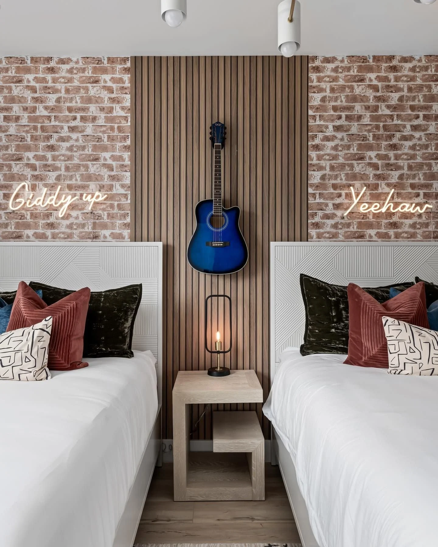
Western-inspired neon signs used as decorative wall art. Image courtesy of Custom Neon.
How to Choose the Right Placement for a Neon Sign
Even the perfect neon sign can fall flat if it's installed in the wrong location. Placement affects how visible the sign is, how it interacts with the room, and whether it feels like an intentional design feature or an afterthought.
One thing I always encourage homeowners and business owners to remember is that a neon sign should work with the space, not fight against it.
Look for Natural Focal Points
One of the easiest ways to incorporate a neon sign is by placing it near an existing focal point.
In residential spaces, this often means above a sofa, bed, fireplace, media console, desk, bar cart, or banquette. In commercial settings, it may be above a reception desk, behind a checkout counter, or on a feature wall that customers naturally notice when entering the space.
When a sign is connected to an existing focal point, it tends to feel more intentional and visually grounded.
Avoid Hanging It Too High
This is probably one of the most common mistakes I see.
People often mount artwork and wall décor too high, and neon signs are no exception.
A sign should generally feel connected to the furniture or architectural feature below it rather than floating somewhere near the ceiling. When it's mounted too high, the relationship between the sign and the rest of the room is lost.
Give It Room to Breathe
Because neon naturally draws attention, it usually benefits from having some open space around it.
If the sign is squeezed between shelves, surrounded by numerous pieces of artwork, or competing with multiple decorative elements, its impact can be reduced.
That doesn't mean the surrounding wall must be empty. It simply means the sign should have enough visual breathing room to be appreciated.
Consider Daytime and Nighttime Views
A sign can look very different during the day than it does at night.
Natural light, nearby windows, lamps, sconces, and ceiling fixtures all affect how the sign is perceived throughout the day. Before committing to a location, think about how the sign will look when it's illuminated and when it's turned off.
The best installations are successful in both situations.
Use Architecture to Your Advantage
Some of my favorite installations are the ones that feel integrated into the room's architecture.
For example, a sign may be centered above a built-in banquette, framed within a wall niche, mounted on a wood slat wall, or positioned against decorative millwork. These placements often feel more intentional because the sign becomes part of the overall design rather than simply something hanging on a wall.
Think About What the Sign Says
The message itself can influence the best location.
A motivational phrase may feel right at home in a home office. A playful saying might work well in a game room or home bar. A business logo often makes the most sense where customers can immediately see it.
Matching the message to the space helps strengthen the connection between the sign and its surroundings.
My Design Tip
Before ordering a neon sign, decide exactly where it's going to live.
I've seen many people purchase a sign first and then try to find a place for it afterward. In most cases, the result is much better when the location is determined early in the design process. Knowing the placement from the beginning makes it easier to choose the right size, color, and overall design.
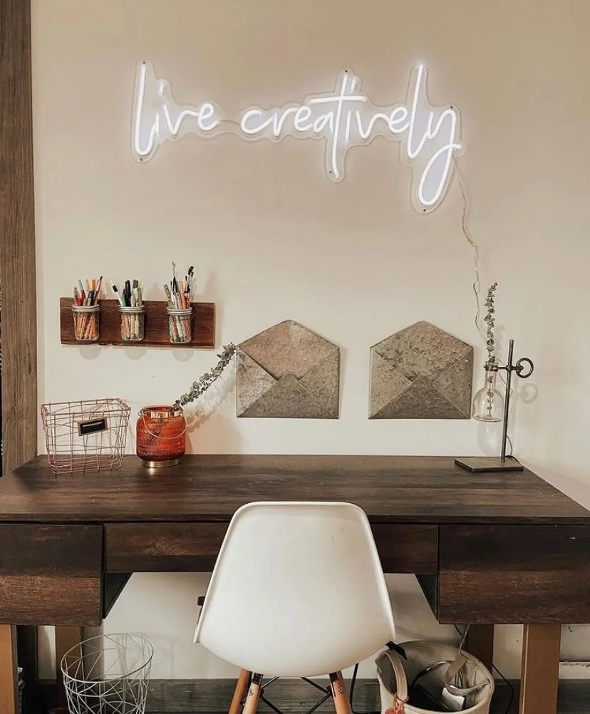
Neon sign used to personalize a home office. Image courtesy of Custom Neon.
Personalizing Your Neon Sign
One of the biggest differences between today's neon signs and those of the 1980s is personalization.
Back then, most neon was designed to advertise a business, promote a product, or attract attention from passing customers. Today, many signs are created specifically for a person, family, business, or event.
That's one of the reasons neon has become so popular in residential spaces. It allows homeowners to display something that feels unique to them rather than purchasing artwork or décor that anyone else can buy.
Start With Something Meaningful
When choosing what your sign will say, I recommend starting with something that has personal meaning.
This could be:
A favorite quote
A family saying
A meaningful date
A nickname
Wedding vows
A business slogan
A company logo
The most memorable signs are usually the ones that reflect something important to the people who see them every day.
Keep It Simple
One mistake I occasionally see is trying to fit too much text into a single sign.
While it may be tempting to include an entire quote or lengthy phrase, shorter messages are often more effective. They are easier to read, easier to design around, and generally create a stronger visual impact.
In many cases, just a few words can say more than an entire sentence.
Consider the Room
The message should make sense for the space where it will be installed.
For example:
A motivational phrase may work well in a home office.
A playful saying may feel right at home in a game room or home bar.
A welcoming message can be effective in an entryway.
A company logo may be the best choice for a reception area or retail space.
When the message reflects the purpose of the room, the sign often feels more natural and intentional.
Turn Handwriting Into a Lasting Memory
One feature I find particularly interesting is the ability to transform handwriting into a neon sign.
Instead of selecting a standard font, you can preserve a handwritten note, signature, or meaningful message and display it as part of your décor.
For example, a family might recreate a handwritten message from a grandparent for a nursery or child's bedroom. Others may choose a handwritten note from a spouse, parent, or close friend. These types of signs often become more than decorative elements because they carry personal history and emotional meaning.
My Design Tip
Before deciding on a phrase, ask yourself whether you'll still enjoy seeing it several years from now.
Trendy sayings can be fun, but the signs that tend to age best are often the ones connected to meaningful memories, relationships, hobbies, businesses, or experiences. Choosing something with lasting significance can help ensure the sign continues to feel special long after it's installed.
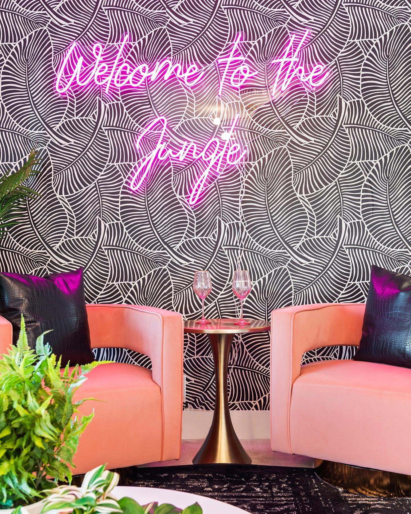
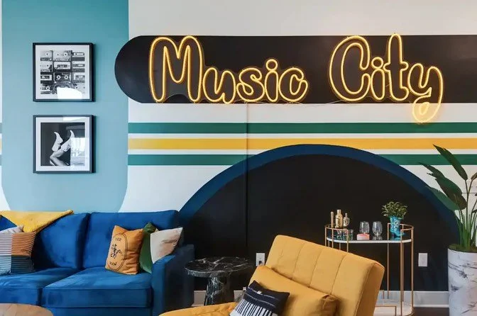
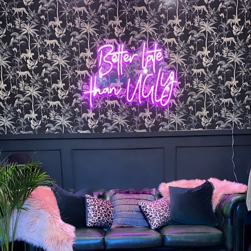
Bold neon sign paired with colorful furnishings and wallpaper. Image courtesy of Custom Neon.
Common Neon Sign Mistakes to Avoid
Choosing a Trend Over Something Meaningful
Social media is full of trendy phrases and popular sayings, but trends have a way of feeling dated after a few years.
If you're investing in a neon sign, I generally recommend choosing something that reflects your personality, family, business, or interests rather than whatever happens to be popular at the moment.
Forgetting About the Sign When It's Turned Off
Most people focus on how a neon sign looks when it's illuminated, but it will spend part of its life turned off.
Before ordering, consider how the sign, backing, and mounting hardware will look during the day. The best installations look attractive whether the sign is on or off.
Choosing a Font That's Difficult to Read
Some script fonts look beautiful in a design preview but become surprisingly difficult to read once installed on a wall.
This is especially important for businesses where customers may only have a few seconds to understand the message.
Overusing Neon in the Same Space
A single neon sign can make a strong statement.
Multiple neon signs in the same room can quickly start competing with one another. Unless you're intentionally creating a themed entertainment space, one well-placed sign is often more effective than several.
Buying Based on Price Alone
Like most things in design, quality matters.
A lower-priced sign may seem appealing initially, but factors such as brightness, durability, color accuracy, and overall construction can vary significantly between manufacturers.
My Design Tip
The best neon signs usually feel personal rather than trendy.
Years from now, you'll be much happier with a sign that reflects something meaningful to you than one that simply followed a design trend that happened to be popular at the time.
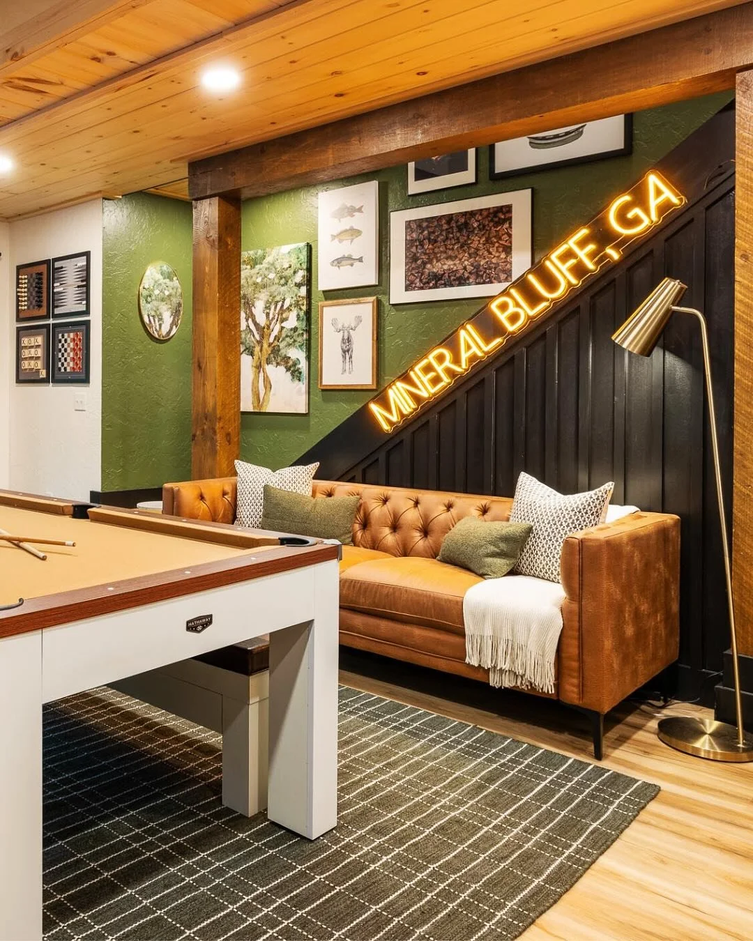
Neon sign used as a focal point in a game room. Image courtesy of Custom Neon.
Frequently Asked Questions About Neon Signs
Are today's neon signs made from real neon?
Not usually. Most neon signs sold today use LED technology that is designed to mimic the appearance of traditional glass neon. LED signs are typically more energy-efficient, lightweight, durable, and easier to install than traditional neon.
Can a neon sign be used outdoors?
Yes, but not every sign is designed for outdoor use. If you plan to install one on a patio, outdoor living space, storefront, or exterior wall, make sure the sign is specifically rated for outdoor conditions and follow the manufacturer's installation guidelines.
Do neon signs use a lot of electricity?
Modern LED neon signs are generally very energy-efficient. While electricity usage varies depending on the size of the sign and how often it's used, they typically consume far less power than traditional neon.
How long do neon signs last?
The lifespan varies by manufacturer and usage, but many LED neon signs are designed to last for years with proper care and installation.
Can a logo be turned into a neon sign?
In many cases, yes. Many manufacturers can recreate business logos, artwork, and other custom graphics as neon signs. This is one reason they have become popular in offices, retail stores, restaurants, and hospitality spaces.
Can handwriting be turned into a neon sign?
Yes. Some manufacturers can transform handwritten notes, signatures, or meaningful messages into neon signs. This can be a great way to preserve a family memory, commemorate a milestone, or create a truly one-of-a-kind design feature.
Are neon signs only for modern homes?
Not at all. While they are commonly associated with modern interiors, I've seen them work successfully in Contemporary, Industrial, Eclectic, Mid-Century Modern, and even some Traditional homes. The key is selecting the right size, color, message, and placement for the space.
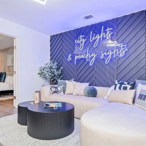
Neon sign integrated into a stylish living room. Image courtesy of Custom Neon.
Where to Buy a Neon Sign
Over the years, I've found that the quality of neon signs can vary significantly from one company to another. While it may be tempting to choose the lowest-priced option, factors such as brightness, color accuracy, craftsmanship, materials, and customer support can make a noticeable difference in the final result.
When shopping for a neon sign, I recommend looking for companies that offer:
Custom sizing options
A wide range of color choices
Font and artwork customization
Dimming capabilities
Clear installation instructions
Warranty coverage
Customer reviews with real project photos
If you're ordering a personalized quote, logo, or handwritten message, reviewing a proof before production can help ensure the final design looks exactly as intended.
I've partnered with Custom Neon and have been impressed by the quality of their work, customization options, and overall customer experience. Whether you're creating a statement piece for your home, a personalized gift, or branded signage for a business, they offer a wide variety of options to suit different styles and spaces.
If you'd like to order a neon sign from Custom Neon, you can use my discount code JJONESDESIGNCO10 to receive a discount on your order.
As with any design purchase, take your time, compare options, and choose a sign that feels meaningful to you and your space.
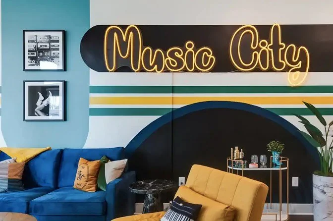
Neon sign incorporated into a residential living room design. Image courtesy of Custom Neon.
Making Neon Part of the Design
A well-designed neon sign can do more than illuminate a room. It can celebrate a memory, showcase your personality, reinforce a brand, or simply add a unique design element that makes a space feel more personal.
By choosing the right color, size, placement, and message, you can create a neon sign that feels intentional and complements the overall design of your home or business for years to come.
If you've found the perfect neon sign but aren't sure how to incorporate it into your space, I'd be happy to help. Through my virtual interior design services, I can help you create a cohesive design plan that integrates your neon sign with the furniture, lighting, finishes, layout, and overall style of the room. Whether you're decorating a home office, media room, retail store, restaurant, or another commercial space, a thoughtful design plan can help ensure your neon sign enhances the space rather than simply hanging on the wall.